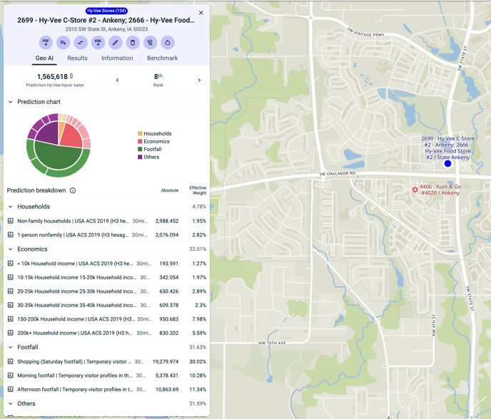
A pie chart to explain the main prediction influencers
Our GEO-AI predictions can free up a lot of your time when it comes to making forecasts for new locations. However, they can sometimes be hard to understand. That's why our GEO-AI users will now find a pie chart next to the prediction results. This pie chart will show the different factors behind the prediction and breaks them down to show which has the most influence for the current location prediction.
New features for the visualisation panel
In this release, we are also bringing a few small changes to the visualisation panel. It is now resizable - this can be handy if you want more room on the map. You can now scroll it entirely. And finally, you can add add statistics directly from the bottom of the statistics dropdown.