![Targomo-logo-email-logo-template.png]](https://info.targomo.com/hs-fs/hubfs/Targomo-logo-email-logo-template.png?height=40&name=Targomo-logo-email-logo-template.png)
We’ve released 10+ new improvements in TargomoLOOP, with a focus on more flexible reports, richer benchmark visualizations, and better zone analysis.
Reports
- Export reports as PowerPoint
You can now export reports in PPTX format. Click Download and choose between Export as PDF or Export as PowerPoint (.pptx). - Show nearby locations and POIs in reports
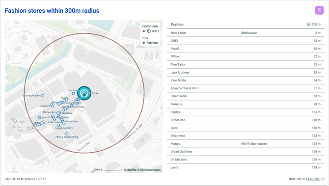
A new Nearby locations widget lets you show locations or POIs within a selected catchment.
Open the widget settings, go to Nearby locations, choose a catchment, and select the locations or POIs you want to include.
You can also rename the list; by default, it is called “Nearby locations.”
For radius catchments, the widget shows the distance from the selected location to each nearby location or POI.
For travel-time catchments such as walking or driving, it shows the travel time instead.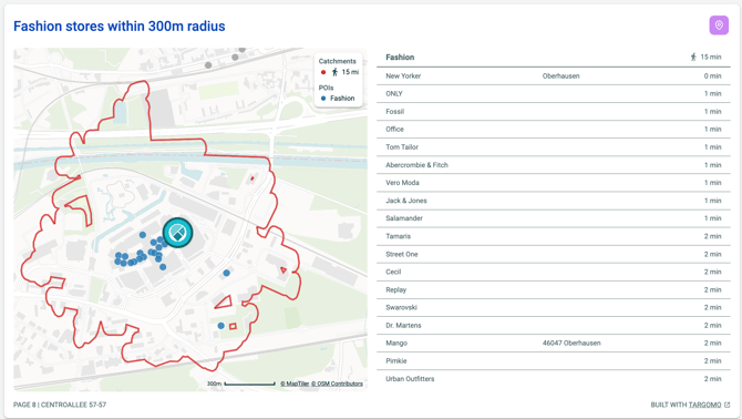
- Show tagged zone data in location reports
Location reports can now include data from zones linked to a location. For example, if a store is located within a mall zone, you can add the mall zone and its associated data to the location report. Zone-related data is available directly from the widget settings. - Add traffic data to report maps
Traffic data layers can now be displayed in map widgets. Open the widget settings, go to the Map tab, and select a traffic layer from the dropdown. - Add zone layers to report maps
Zone layers can now be displayed directly in map widgets, providing additional geographic context in your reports. - Create reports for zones
You can now create a report directly from a zone. Select a zone and choose the option to create a zone report. You can configure the report using data already added to your zone analysis.
Detail View (Left side panel)
- Visualize benchmarks with charts
Benchmark mode now supports chart visualizations. Expanded benchmark mode shows your comparison as a chart and switch between bar, line charts, and table.
Show individual locations in benchmark charts
When benchmarking against up to five locations, you can display the individual locations that make up the benchmark directly in the chart. This is also supported for benchmark areas and zones. - Clearer benchmark column headers
Benchmark mode now includes column headers consistent with the benchmark table, making it easier to distinguish the selected location’s value, the benchmark value, and the difference between them.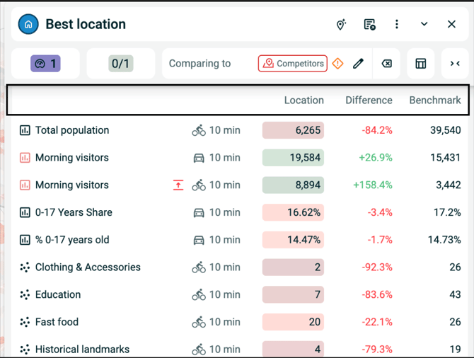
Advanced Visualisation (Right side panel)
-
Filter demand attraction and cannibalisation cells. For eg. it will allow you to filter and show only the cells which as demand attraction between 20% and 100% or cells where the cannibalisation is less i.e data attracted to only the selected location.
Filtering demand attraction -
Filter cannibalisation -
Customization Settings
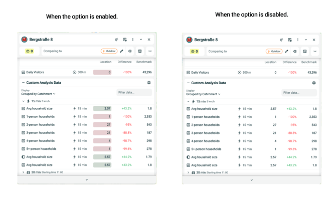
- Disable benchmark coloring
You can now turn off benchmark coloring if you prefer a more neutral presentation. Go to Settings → Customization and disable Benchmark coloring.
NOTE: Benchmark must be selected to see the effect of this option.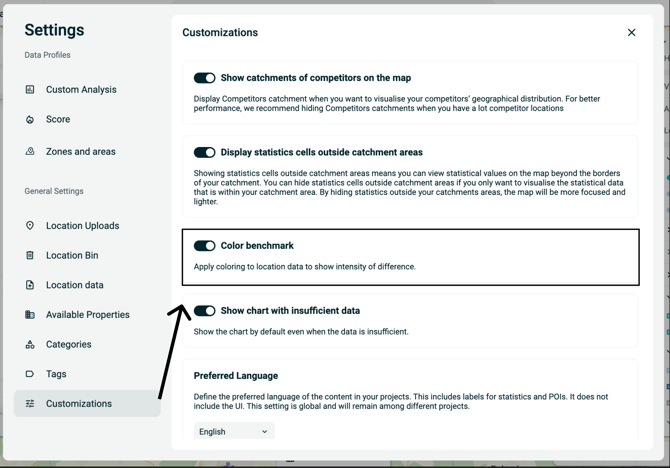
- Show charts when data is limited
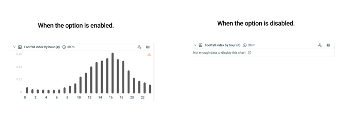
You can choose to display charts even when there is insufficient or limited data. Go to Settings → Customization and enable the option to always show charts with insufficient data.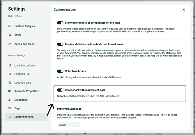
Map
- Analyze zones before saving
After drawing a zone, you get the option to analyse the zone before saving to network or add it to the network.